
so,..my news this week is that i have been shortlisted to appear on a new interior design program.
the final interview is this coming wednesday! and to say that i am freaking. out. is. a. slight. understatement.
as part of the interview process, i have to design an apartment. an entire apartment. including lighting, paint, soft furnishings, moving walls, choosing fixtures. etc.etc.etc
and then present it.
to a panel of exec producers.
yah.
so,.i have been madly creating storyboards,.altering floorplans and making colour choices.
which gets me to the point of this post.
pantone colour of 2011. honeysuckle. like or not?

personally, i love.
i painted an entire hallway in our old house with this colour. mr. plain called it whorehouse pink. it was beautiful.
this is what pantone has to say about miss. honeysuckle.
'Courageous. Confident. Vital. A brave new color, for a brave new world. Let the bold spirit of Honeysuckle infuse you, lift you and carry you through the year. It’s a color for every day – with nothing “everyday” about it.'
While the 2010 color of the year, PANTONE 15-5519 Turquoise, served as an escape for many, Honeysuckle emboldens us to face everyday troubles with verve and vigor. A dynamic reddish pink, Honeysuckle is encouraging and uplifting. It elevates our psyche beyond escape, instilling the confidence, courage and spirit to meet the exhaustive challenges that have become part of everyday life.
“In times of stress, we need something to lift our spirits. Honeysuckle is a captivating, stimulating color that gets the adrenaline going – perfect to ward off the blues,” explains Leatrice Eiseman, executive director of the Pantone Color Institute®. “Honeysuckle derives its positive qualities from a powerful bond to its mother color red, the most physical, viscerally alive hue in the spectrum.”
Eiseman continues, “The intensity of this festive reddish pink allures and engages. In fact, this color, not the sweet fragrance of the flower blossoms for which it was named, is what attracts hummingbirds to nectar. Honeysuckle may also bring a wave of nostalgia for its associated delicious scent reminiscent of the carefree days of spring and summer.”
Honeysuckle is guaranteed to produce a healthy glow when worn by both men and women. It’s a striking, eye-catching hue that works well for day and night in women’s apparel, accessories and cosmetics, and in men’s ties, shirts and sportswear. Add a lively flair to interior spaces with Honeysuckle patterned pillows, bedspreads, small appliances and tabletop accessories. Looking for an inexpensive way to perk up your home? Paint a wall in Honeysuckle for a dynamic burst of energy in the family room, kitchen or hallway.

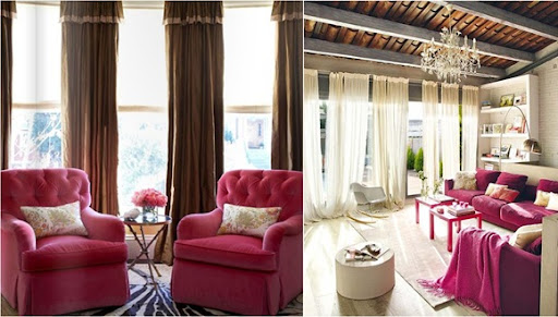
couldn't agree more.
so, i am off to find me some honeysuckle,..to keep from freaking out too much!
jane xx
5 comments:
Wow...pretty great about the Interior Design program! Hope you get it.
Love the whorehouse pink..ha
Ashlyn
So excited for you! Cant wait to hear of your story. The colour is exciting cant wait to see what you do with it!
I'm sure whatever you choose, you'll make work for you. Personally I couldn't live with that colour, but I never was a pink person! lol
Jane congratulations! that is fantastic news! I really hope you get chosen :))
I love the honeysuckle pantone colour too, it's vibrant and fun and just really great- being a colour person you definitely have my approval!
xo
yay!! top design! way to go!!! good luck!!
Post a Comment